Of 65 AI app video creatives submitted, 38 had readable segment-level semantics. In those 38, the dominant persuasion method is not explaining the feature — it is showing the output: before/after at 18.4% and input-to-output at 15.8%, 34.2% combined, against 15.8% that show only the interface and 47.4% that demonstrate no function at all. AI companion apps almost never show a product screen; they run point-of-view scenes. And 73.7% of the sample ends without any call to action — zero creatives carried a subscription or trial CTA.
How do AI app ads prove they work?
Four ways: before/after (18.4%), input-to-output (15.8%), result carousel (2.6%) and interface walkthrough (15.8%). The first two combine to 34.2%, which says the category's default is to show one verifiable visual difference rather than explain the technology.
Strip out the companion apps and look only at photo, generation and camera tools (n=30): before/after 23.3%, input-to-output 20.0%, interface 20.0%, carousel 3.3%, and 33.3% with no demonstration.
How 38 AI app creatives demonstrate value
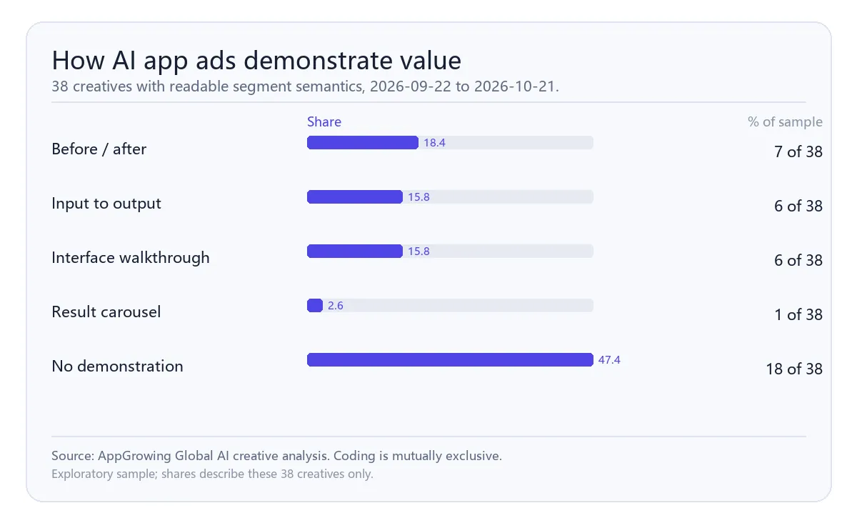
What are the 47.4% that demonstrate nothing actually doing?
Mostly narrative. Seven of eight companion-app creatives are point-of-view emotional scenes with no interface at all; the rest are brand activities such as challenges and contests. These ads sell a relationship, not a feature.
So the category runs two creative languages: tools persuade through output comparison, companions through situational immersion. Mixing the two usually fails on both sides.
What carries the first three seconds?
A real person appears in 50.0% of the readable openings, result-first in 26.7%, a pain-point question in 13.3%, and pure visual demonstration in only 6.7%.
The high share of on-camera people may reflect a need to prove a human uses the tool, or simply that UGC is cheap to shoot. Treat it as structure, not as a performance finding — there are no performance fields in this pull.
For a growth team the practical read is narrower. A talking head buys you the first second cheaply, but it also pushes the product proof later, which is why so many of these ads pair an on-camera opener with an input-to-output sequence in the middle. The opener earns attention; the middle has to earn belief.
What do length and endings have in common?
78.9% run under 30 seconds, peaking in the ≤15s and 16–30s bands. Every creative above 60 seconds (10.5%) is held up by narrative: a long UGC voiceover tutorial or a companion-app story.
The ending is the biggest gap. 73.7% carry no CTA, and all eight that do point to a download or a retry, never to a subscription or trial. For a category that monetises on subscription, that is a visible break in the funnel.
How should a team use this structure?
Three rules. First, if the product's value is a visible difference, use before/after and skip the screen recording — an interface proves existence, not usefulness. Second, if you are building a companion app, do not force a feature demo; use a POV scene, but restore the download or trial action at the end. Third, treat 30 seconds as the default spec, and only exceed 60 when a narrative carries it.
What not to do: do not generalise these 38 creatives to the category; do not read the prevalence of on-camera people as a requirement; and do not use this sample to discuss subscription conversion, because that field was never returned.
One thing is worth flagging to whoever owns the store page: if three quarters of the paid creatives stop at the download step, the subscription pitch is happening entirely after the click. That is a funnel decision rather than a creative one, and it is invisible if you only review the ads.
Want your app creatives benchmarked?
Get a free benchmark check based on your specific app or game category.
